Intro
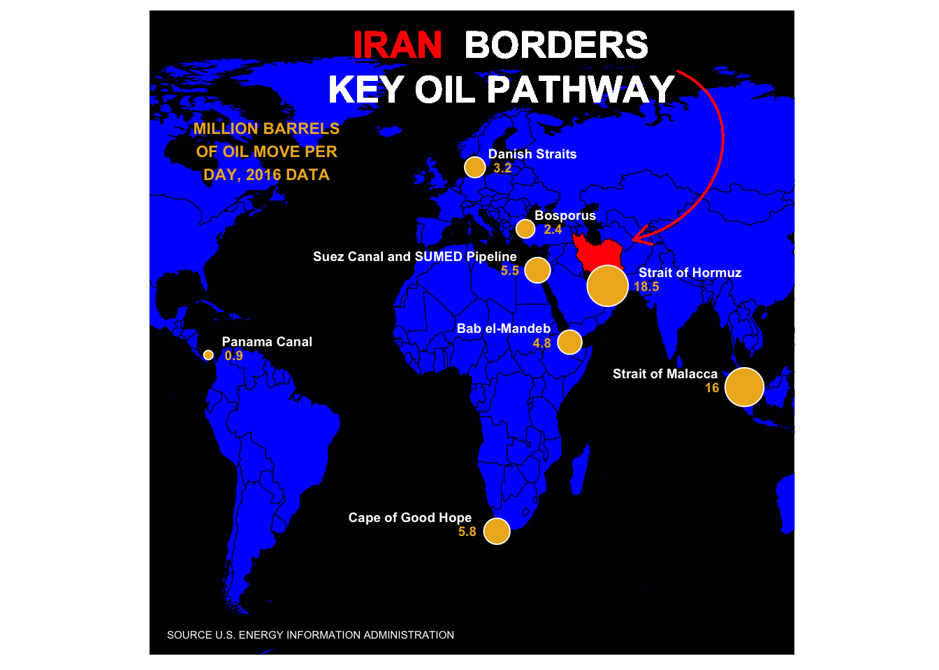
I was inspired by this graphic on Yahoo Finance. In the TidyTuesday spirit, I set out to recreate it using ggplot2. There were a few things I would have to figure out - how to apply ggtext to an annotation, how to draw a curved arrow, and how to create a pinhole like border around the graphic. That last point, well, I haven’t figured that one out yet and so I am looking for ideas from the R community. The graphic requires very little data that is easy enough to type out from scratch, but I found the source data in a pdf file and couldn’t resist using tabulizer to extract it.
library(tabulizer)
library(tidyverse)
library(sf)
library(rnaturalearth)
library(rnaturalearthdata)
library(ggtext)
library(here)
Using Tabulizer to extract the source data
If you are looking to extract the data directly from the source pdf file, here is the code for that.
# Not Run
    # This is the source location of the data in a pdf file
#location <- str_c("https://www.eia.gov/beta/international/analysis_includes/",
#                  "special_topics/World_Oil_Transit_Chokepoints/wotc.pdf")

    # Use tabulizer to extract the relevant portion of the data table on page 2 of the pdf
#extract <- extract_areas(file =location, pages = 2, resolution = 100)

    # Set up the data as a data frame and then isolate just year 2016 for the graphic
#df <- as_tibble(extract[[1]][2:nrow(extract[[1]]),])
#names(df) <- extract[[1]][1,]

#data <- df %>%
#    select("Location", Barrels = "2016") %>%
#    mutate(Barrels = as.numeric(Barrels))

#coord <- tribble(
#~Location, ~Lat, ~Lon,
#"Strait of Hormuz", 26.5667, 56.2500,
#"Strait of Malacca", 1.4300, 102.8900,
#"Suez Canal and SUMED Pipeline", 30.4550, 32.3500,
#"Bab el-Mandeb", 12.5833, 43.3333,
#"Danish Straits", 56.0000, 11.0000,
#"Turkish Straits", 40.7225, 28.2247,
#"Panama Canal", 9.38743, -79.91863,
#"Cape of Good Hope", -34.3548, 18.4698
#)

#data <- data %>%
#    left_join(coord, by = "Location")
    #The source data has "Turkish Straits" but Yahoo Finance labeled it "Bosporus".
#data[data$Location =="Turkish Straits",1] <- "Bosporus"

#write_csv(data, "oil_pathway_data.csv")
Or you can get the prepped data set directly from my github at: https://github.com/stomperusa/VisualReproduction/tree/master/OilPathways
data <- read_csv("oil_pathway_data.csv")The Graph
I have just recently discovered ggtext and the ability it introduces to control formats within a label. I was expecting to set the title of the graph as an annotation given that it sits within the plot. My first learning point was that ggtext has geom_richtext() for this purpose.
title <- "<b style='color:#FF0000'>IRAN</b> <b style='color:#FFFFFF'>BORDERS<br> KEY OIL PATHWAY</b>"I used rnaturalearth for the map. The original may be based on another map projection given the orientation differences apparent at the top of the graphic, around Greenland for example.
world <- ne_countries(scale = "medium", returnclass = "sf")The geom_curve was a new discovery for me as well. How to get the pinhole effect and the shading around the borders eludes me. Reach out if you know how to resolve.
Here is my stab at reproducing the graphic. Obviously there is a bit more fine tuning I could do to get it closer to the original, but I got what I wanted out of the exercise.
plot <- ggplot(data = world) +
    geom_sf(fill = "blue", color = "black", size = 0.2) +
    geom_sf(data = subset(world, geounit == "Iran"), fill = "red", color = "black", size = 0.2) +
    geom_point(data = data, aes(x =Lon, y=Lat, size = Barrels),
               shape = 21, fill = "goldenrod2", color = "white", show.legend = F) +
    geom_text(data = data, aes(x =Lon, y=Lat, label = Location), color = "white", size = 2.5,
              vjust = -1, hjust = c(-0.3, 1.25, 1.1, 1.2, -0.15, -0.15, -0.15, 1.2),
              fontface = "bold") +
    geom_text(data = data, aes(x =Lon, y=Lat, label = Barrels), color = "goldenrod2", size = 2.5,
              vjust = .5, hjust = c(-1.0, 2.7, 2.0, 2.0, -1.0, -1.0, -0.9, 2.1),
              fontface = "bold") +
    scale_size_continuous(range = c(2, 10)) +
    annotate("text", x = -60, y = 60, label = "MILLION BARRELS\nOF OIL MOVE PER\nDAY, 2016 DATA", size = 3,
             color = "goldenrod2", fontface= "bold") +
    annotate("text", x = -45, y = -60, label = "SOURCE U.S. ENERGY INFORMATION ADMINISTRATION", size = 2,
             color = "white")+
    geom_richtext(x = 20, y = 80, label = title, size = 7.0, fill = NA, label.color = NA) +
    geom_curve(aes(x = 80, y = 80, xend = 65, yend = 38), color = "red", arrow = arrow(type = "open",
              length = unit(0.15, "inches")), curvature = -0.75, angle = 100, ncp =10) +
    coord_sf(xlim = c(-100.00, 120.00), ylim = c(-65, 95), expand = F) +
    theme(panel.background = element_rect(fill = "black"),
          panel.grid = element_blank(), axis.title = element_blank(), axis.ticks = element_blank(),
          axis.text = element_blank(), aspect.ratio = 1)
plot
#ggsave(here::here("oil_pathways.png"), plot, dpi = 320, width = 20, height = 20, units = "cm")Here’s the link to the article that contains the original: