Intro
Waterfall graphs are an effective visualization of what could be many increments and decrements that account for the difference between two values. In management information systems, for example, these graphs are often used to represent how an organization uses its budget, or how each product line contributed to total sales. In the following article, I provide a template for how to set up a basic waterfall graph in R with dplyr and ggplot2 libraries.
library(tidyverse)Basic Waterfall Graphs
A waterfall graph generally reads from left to right with the starting and ending values represented by vertically drawn bars. Connecting the two bars is a series of incremental or decremental steps sized by the associated values that ultimately sum to the difference between the beginning and ending values.
We first look at how to structure the data in the example below based on the need to demonstrate a budget reduction from 5 to 4.5 million. You should structure your data such that the first row of data represents the start point, the last row the end point, and those in between are the incremental increases and decreases. You want the sum of the value column to be zero, so you flip the sign on either the starting or the ending value.
In the example, the first row, “Prev Budget” carries the initial value of 5. The last row, “Current Budget” carries the final value of 4.5 with the sign flipped. The seven rows in between are the incremental increases (if positive) and decreases (if negative). Note the second to the last row I’ve labeled “Gap to Target”, a convention for how to show work is still in progress to get the numbers to align.
df <- tribble(
    ~Category, ~Value,
    # --------- header record ----------
    "Prev Budget", 5,
    "Salaries", 0.1,
    "CapEx", 0.175,
    "Travel", -0.2,
    "Contracting", -0.1,
    "Operations", -0.2,
    "RealEstate", -0.1,
    "Gap to Target", -0.175,
    "Current Budget", -4.5
)
df
## # A tibble: 9 x 2
## Category Value
## <chr> <dbl>
## 1 Prev Budget 5
## 2 Salaries 0.1
## 3 CapEx 0.175
## 4 Travel -0.2
## 5 Contracting -0.1
## 6 Operations -0.2
## 7 RealEstate -0.1
## 8 Gap to Target -0.175
## 9 Current Budget -4.5all.equal(sum(df$Value), 0) # check that the sum of the values is zero## [1] TRUEOnce we have our data in a format such as this, we can begin to make the data enhancements required to generate the waterfall graph.
levels <- df$Category

data1 <- df  %>%
    mutate(Category = factor(Category, levels = levels),
        ymin = round(cumsum(Value), 3),
        ymax = lag(cumsum(Value), default = 0),
        xmin = c(head(Category, -1), NA),
        xmax = c(tail(Category, -1), NA),
        Impact = ifelse(Category %in% c(as.character(df$Category[1]), as.character(df$Category[nrow(df)])),"Budget",
                        ifelse(Value > 0, "Increase", "Decrease")
           ))
The first step in further preparing the data is to create a variable “levels” that captures the values of the Category field. We will use this below when we change the Category field to a factor, and to set the titles of the columns on the x-axis.
Next we modify the Category field in the data set to be a factor. The key point here is that factors have integer values associated with them and we will use those values to control the plotting on the x-axis. We use the “level” variable to set the levels of the factor so that we preserve the order. We create min and max values for both x and y coordinates that will be used to plot the bars. Finally, we create what I call the Impact variable which is a classifier to distinguish the two budget columns from the incremental values, and whether the incremental values are increasing or decreasing. Will use the field to determine the color fill for the bars.
The data set should then look like this.
data1## # A tibble: 9 x 7
## Category Value ymin ymax xmin xmax Impact
## <fct> <dbl> <dbl> <dbl> <int> <int> <chr>
## 1 Prev Budget 5 5 0 1 2 Budget
## 2 Salaries 0.1 5.1 5 2 3 Increase
## 3 CapEx 0.175 5.28 5.1 3 4 Increase
## 4 Travel -0.2 5.08 5.28 4 5 Decrease
## 5 Contracting -0.1 4.97 5.08 5 6 Decrease
## 6 Operations -0.2 4.78 4.97 6 7 Decrease
## 7 RealEstate -0.1 4.68 4.78 7 8 Decrease
## 8 Gap to Target -0.175 4.5 4.68 8 9 Decrease
## 9 Current Budget -4.5 0 4.5 NA NA BudgetNow we are ready to graph. We start by setting up the theme and label elements.
g <- ggplot(data1) +
        theme_bw()+
        theme(legend.position = "right", panel.grid = element_blank(),
            axis.text.x = element_text(angle = 90, vjust = 0.5)) +
        labs(y = "USD Millions", x = "Expense Category", title = "Explanation of Budget Gap Closure")
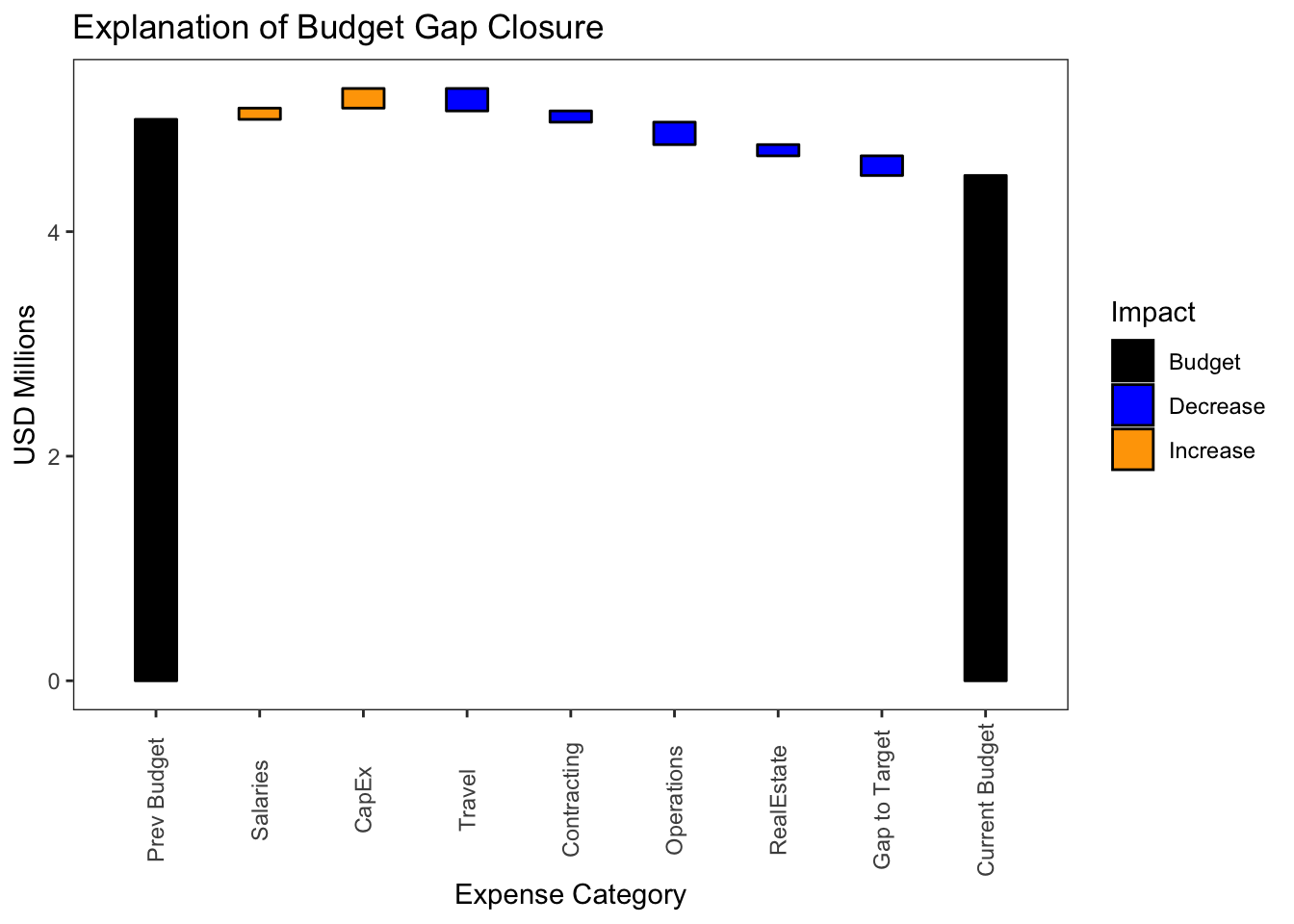
Next we use geom_rect() to plot the bars. Before doing that, we create a variable ‘w’ that we will use to set the width of the bars. Any positive value less than 1 is acceptable. Values of 1 or greater will run the bars together horizontally. The placement of the bar will be split evenly on either side of the x value designated by the factor value of each column.
w <- 0.4  #use to set width of bars

g <- g +
    geom_rect(aes(xmin = as.integer(Category) - w/2,
                  xmax = as.integer(Category) + w/2, ymin = ymin, ymax = ymax,
                  fill = Impact), colour = "black") +
    scale_x_discrete(limits = levels) +
    scale_fill_manual(values = (c("Decrease" = "blue", "Increase" = "orange", "Budget" = "black")))
g
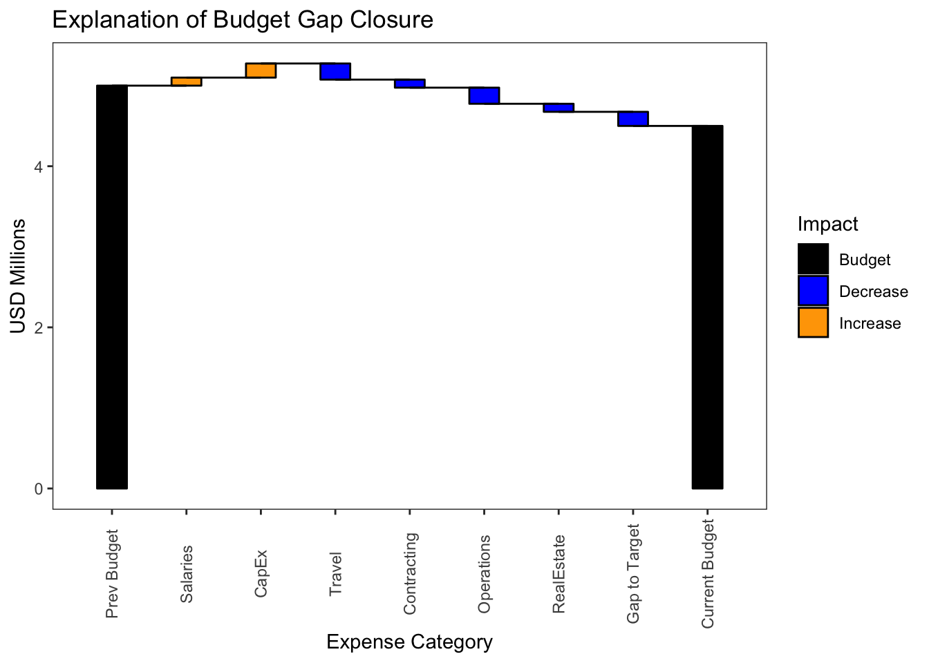
We have the beginnings of a waterfall chart but it is challenging to visually align the individual bars. This is where the addition of line segments makes a huge difference.
g <- g +
    geom_segment(data = data1[1:(nrow(data1) -1),],aes(x = xmin,
                                                       xend = xmax,
                                                       y = ymin,
                                                       yend = ymin))
g
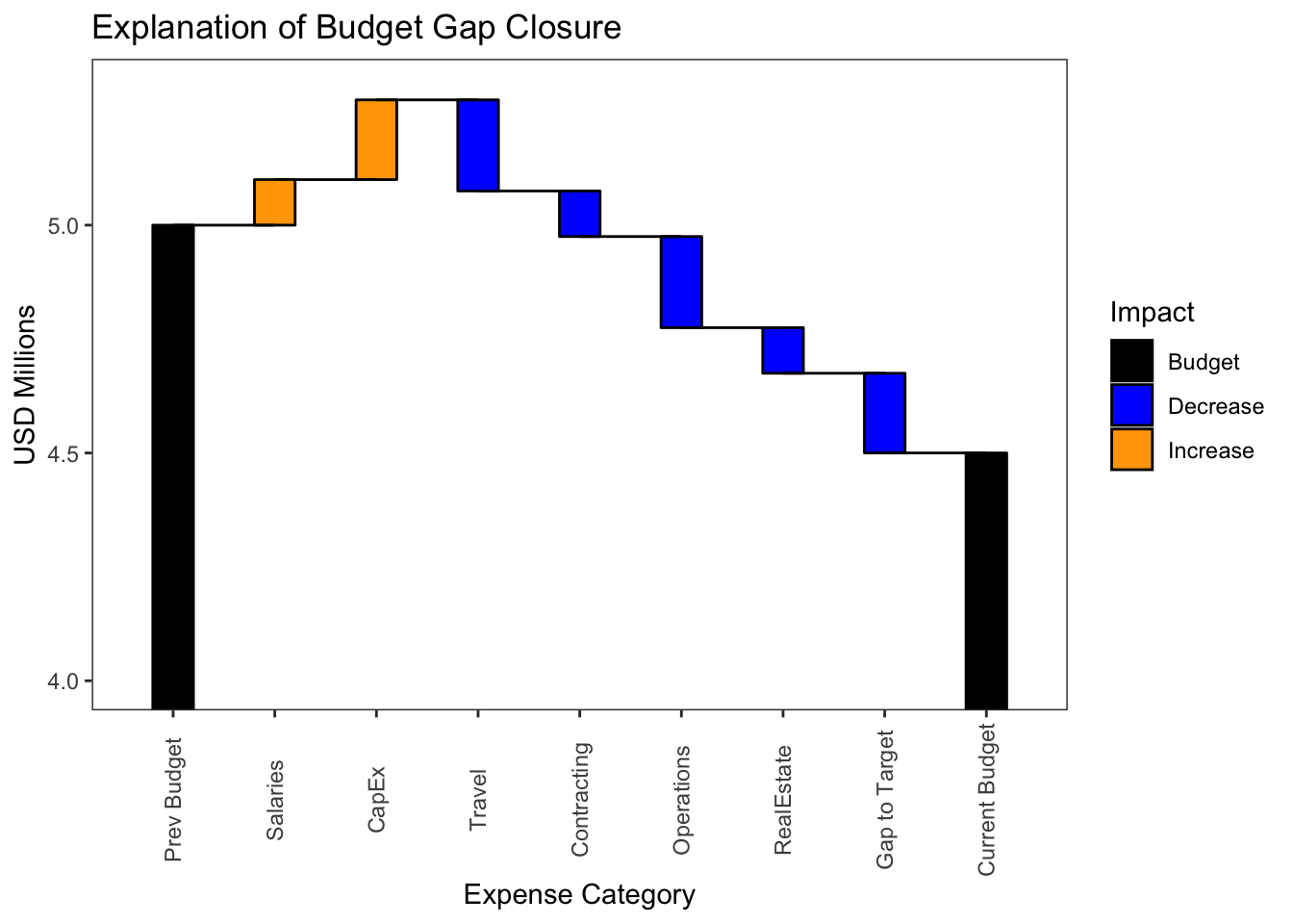
Lastly, there is much unnecessary and undesired white space in the middle of this chart driven by the size of the budget values versus the increments. We can zoom in on the important upper section of the graph with the ylim parameter of the coord_cartesian() function. Note we use the coord_cartesian() instead of ylim() to preserve the value bars for the two budget columns which ylim() would otherwise omit as out of range.
g + coord_cartesian(ylim=c(4, max(data1$ymax)+.025)) 
Here is one last thought on the ordering of the data set. You may want to consider the sort order of the rows that carry the incremental values as they impact the readability of the plot. For example, if there isn’t already a natural order to the data, you may want to show all of the increases first followed by the decreases. This, however, will maximize the height of the y-axis and require the most space to capture the full story. Another way to organize that gives a sense of order to what could otherwise be a tiresome set of up and down steps is to sort descending based on the absolute value of the increment. The eye should see the pattern of diminishing variability as it scans left to right. If you are using a “Gap to Target” field to account for work still in progress to get the numbers to align, you may want to consider filling with another color to make it easier to find on the graph.
In my next article, I will cover a more complex type of waterfall graph that plots stacked bars over time series data.